Building Your Website: What You Need to Know
Think about how many websites you come across in a day. Of those websites, think about how quickly you have passed on a website because of its poor design. A website can make or break you professionally. For many, it is a first (and sometimes last) impression.
This is why you want to make sure that your website is showcasing your abilities/services/etc. to the max with clean and consistent design. Not sure how to accomplish this? You’ve come to the right place. I’m going to go over the dos and don’ts of a good website. This should set you on the right track for having the perfect professional website to attract – and keep – clients.
Research design trends
This will help your website stay modern and fresh! Design trends are always changing, so it’s important to stay up to date on industry changes.
Explore other websites
Looking at other websites, whether they are part of the same industry or not, is a great way to get an idea of how you want your website to look and feel. Just be sure you’re not directly copying someone’s website. There are also many sites that compile photos of other websites that have gorgeous design – see the “resources” section at the bottom of this post for more info.
Make notes
While you’re exploring other websites, make notes! Write down what you like about other websites so when you get down to creating your own you can pick and choose your favourite aspects of other websites and build them into your own.
Stick to the basics
We aren’t in 1999 anymore. Neon-colored text on a flashing background just doesn’t work anymore on the web. If you look at the most popular websites out there today you’ll likely find most have quite a lot in common:
- Black text on a white background
- A simple, one or two-column layout
- A navigation bar at the top of the page, and a footer at the bottom
- Limited use of scrolling banners
- A clear use of headers, sub headers, and body text
- Images aligned with the text where it makes sense
The bottom line: Don’t try to reinvent the internet and please don’t try to be clever. Neon letters, pointer streamers and dancing cats have had their day. They don’t need to make an appearance on your site.
Avoid using Flash
You’ve found some inspiration by doing research and browsing other websites and you’re ready to start putting your site together. When doing so, don’t create a Flash website! There are a few reasons for this. For one, having a flash website drastically impacts search engine optimization (SEO) in a negative way. Search engine bots that crawl the web for data from websites can’t index Flash pages properly, so your search engine rankings end up being drastically lower (meaning you won’t appear in the first page of Google, for example!)
Also, users who don’t have the latest Flash Player installed on their computers will see nothing but a blank screen or worse, an error message, when they try and visit your page. Finally, Flash based pages are difficult to optimize for mobile viewing, which means that anyone trying to view your page on a mobile device won’t have a great user experience.
Don’t have music that plays automatically
There’s nothing more annoying than browsing the web, perhaps listening to your favourite tunes at the same time, and having conflicting music play automatically from a website you’ve landed on. For many users, this is an instant turn-off. Just don’t do it!
Consider the user’s experience
When you’re designing your website, or after it’s done, make sure you take some time to consider the user’s experience. A user experience is about how someone interacts with your website: how it looks, its functionality, and its language. Consider asking yourself: Is my website clean and clear? Does my user immediately know what my website is about, what I’m offering? Does it flow nicely? Is it easy to figure out where to go next? You want to make sure when the user lands on your website they know exactly what to do.
Now let’s face it. It’s almost impossible to critique your own work with an objective eye. Therefore, you might want to consider asking friends and family to go through your website to get some feedback on their experience. Make sure you find people who aren’t going to sugar-coat the feedback – get their honest opinion and don’t take it personally.
Don’t use photos you don’t have the right to
Yes, this means you, copier and paster. Don’t copy and paste images from search engines like Google onto your website. This includes stock photos for which you have not paid for. Many images are tied to licensing use, and you could potentially get yourself into legal trouble using photos without the consent of the original source.
Don’t use stock photos to give an idea of what your product/services might look like
Stock photos can be deceiving to clients. You want to make sure that the photos you are using are photos of your work. For example, you don’t want to be using a stock photo of 3 tiered cake in your portfolio if you didn’t make it yourself. Use high-quality original images of your own work to showcase exactly what you’re capable of!
Along the same point, you want to make sure that the photos you’re using as background images or icons are relevant to the product or service that you’re selling. You might love cats, but if you’re running a website for your services as a makeup artist, cats don’t really belong there.
Be careful with fonts
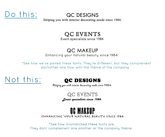
Try to stick to 3 or 4 fonts – MAX! Contrasting fonts is a great way to get a nice website, but when you’re using more than 3 different types and the font theme also doesn’t match – it can leave your website looking unprofessional and thrown together.
Contrasting fonts should still be balanced and theme-appropriate. For example, don’t mix spooky fonts with floral-y fonts. And on that note, if your website is not a Halloween shop, don’t use spooky fonts. Period.
It takes time to find the perfect fonts for your website. Try out as many as possible until you find something that feels right. Don’t limit yourself to the fonts that came with your computer, there are hundreds of websites that have free fonts for you to download and use. Just be sure to check the licensing requirements before you use them, you want to make sure they are free to use commercially.
Use color palettes
Using color palettes is a great way to design a website that looks balanced. You don’t want to use too many colors, and you don’t want to use colors that don’t complement one another. Now’s a great time to get acquainted with a color wheel!
Have personality!
Don’t be afraid to inject personality into your website. This can be done through your images and through your copy’s tone and manner. It’s important for clients to get a feel for who you are, and having a cold formal tone is not always the best idea. Go back to your brand description and values. Make sure these are represented in your website’s look and feel.
Don’t be afraid to ask for help
There are countless resources out there that can help you with your website. If the thought of creating a website terrifies you, fret not! If you’ve got a bit of a budget, there are tons of amazing web designers who will work with you to give you a website that speaks to you. There are also plenty of websites that help you easily build a beautiful website. Some are free, and some are not.
Check out our business archives for more information on how to boost your business!
RESOURCES
INSPIRATION
COLOR PALETTES
WEBSITE BUILDING
blogspot.com
squarespace.com
wix.com
weebly.com
wordpress.com
WEB DESIGN TRENDS
STOCK PHOTOS ETC.
creativemarket.com
shutterstock.com
istockphoto.com
gettyimages.ca
veer.com


